Wednesday, April 13, 2016

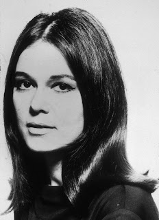
Gloria Steinem


This is no simple reform. It really is a revolution. Sex and race because they are easy and visible differences have been the primary ways of organizing human beings into superior and inferior groups and into the cheap labour in which this system still depends. We are talking about a society in which there will be no roles other than those chosen or those earned. We are really talking about humanism.
Who is speaking? 
Gloria SteinemWhy was/is the speech important to society? 
This speech was given at the height of the Women's Movement. Her speech addresses equality for women and other races in America. Why do you feel in is important or interesting? 
This speech is important because of it was given during a critical time for women's rights. The world was a very different place back then and things are better now but still not great so its still relevant today. 
What is the emotion, mood, tone, personality, feeling of the speech?
Uplifting, powerful and makes you think about the true issues of the world. 
What is intonation, emphasis, what is loud, stressed, or soft. Where are there pauses... 
This is hard because she speaks pretty much the same throughout the whole speak. But the most important words are, revolution, superior and inferior groups, chosen, earned and humanism. The last word is really the most important part of all of it. 
What do you FEEL should be loud or soft, long pause or rushed?
"Sex and Race" should be loud, and "orangizing" and "superior and inferior groups", "Society" , " No Rules" and "Chosen or those Earned", lastly "humanism" should be loud. All of these words and lines in quotes make this whole speak important, so they need to be called out. 
How does it make you feel? 
It makes me feel empowered to go out and do something to help the injustices that are still happening today in the world. 
How do imagine that the audience felt? 
I can imagine that the audience felt the same pride I did to go out and support the women's rights movement. Some people probably didn't respond the same way but theres always those people. Could there be another interpretation of the speech?
Someone who doesn't believe in equal rights this speech probably seems like a load of poop. Write/find a short bio, of the person giving the speech. 
Gloria Marie Steinem (born March 25, 1934) Gloria Steinem was born March 25, 1934, in Toledo, Ohio. She became a freelance writer after college and grew more and more engaged in the women's movement and feminism. She helped create both New York and Ms. magazines, helped form the National Women's Political Caucus, and is the author of many books and essays. A breast cancer survivor, Steinem celebrated her 80th birthday in 2014.
Monday, February 22, 2016

Verner Panton

He is a Danish designer and architect who was one of the most innovative of all 20th-century designers, exerting a lasting and far-reaching influence through his sculptural designs, some of them playfully futuristic, and the vividly colored works he designed.In 1955 Verner Panton opened a practice of his own in Copenhagen. In the years after, Panton stirred up quite a bit of controversy with his innovative architectural concepts, such as a prefab foldable house, Cardboard House, and a Plastic House. He was active from the 1950s as an interior decorator, exhibition designer, and all-round designer.Verner broke entirely with convention, designing rooms as landscapes in vibrant color tones, sometimes entirely in shades of red, as in the interior in 1958 of "Komigen Kro, a guest house in Langesø on the island of Funen. For this interior,  Panton also designed the "Cone" chair. In 1960 he turned it into the "Heart" chair, which also featured a cone bottom foot, and came up with other variations on the original "Cone" that were all made by Plus-Linje. The unusual way Verner Panton dealt with furnishings and other features of his interiors would become typical of the other interior appointments he designed. His carpet and wallpaper patterns, inspired by Op art, were almost always in vibrant colors. By 1955 Verner Panton had come up with a design for a swing chair made of a single piece of laminated wood, the "S" chair. 


Sunday, February 21, 2016

Abbott Miller

Miller hates logos because of the amount of time people spend obsessing over the logo its self when they should be more concerned about how its used. He says that design is about creating narratives, not just beautiful shiny objects. During his life as a designer he went through the digital revolution that is the lap tops and programs that we have today. Design is more talked about today then it was when he was first starting out. Few people did design, or even know what typography was. Now it seems like everyone is a fan of graphic design and its importance. Now graphic design is the face of companies and their success with their branding, when then you had to argue the importance of design to companies. Branding is now something that people obsess about. Miller prefers the word identity opposed to brand, because it sounds more contextual. Branding is so strict to impression and experience, where as identity is an experience, its the company and who it is. People are too worried about the brand when they should be worried about the identity of the company. 

Monday, February 1, 2016

Type 2

The advantages of a multiple column grid are it is more flexible for design, there is a lot more options for placing text and pictures, you rant as limited. A good guideline for how much text fits on one line is between 9 and 12 words but 12 can sometimes be too much to read depending. The baseline grid is used as an underlaying structure that helps guide the vertical spacing of your design.Justified type has a very geometric appearance, created by both the right and left margins being aligned. Ragged type is easier to set, more natural to read, and requires less adjustment to finesse. Rag right settings are more informal, such that the reader usually doesn’t even notice the alignment. Rivers itypography are gaps in typesetting, which appear to run through a paragraph of text, due to a coincidental alignment of spaces. The flow line or clothesline is an imaginary line that aligns horizontally to text and allows for easy readability and flow.Hanging punctuation is when the quotation mark hangs outside the line of the text.Combining typefaces is like making a salad. Start with a small number of elements representing different colors, tastes, and textures. hen mixing typefaces on the same line, designers usually adjust the point size so that the x-heights align. Some different ways to indicate a new paragraph are indents, adding space between paragraphs.


Monday, January 25, 2016

David Carson

David was born September 8, 1955, Corpus Christi, Texas. He is an American graphic designer, whose unconventional style stirred up visual communication in the 1990s.Carson came to graphic design relatively late in life. He was a competitive surfer,ranked eighth in the world and a California high-school teacher when, at 26, he enrolled in a two-week commercial design class. Discovering a new calling, he briefly enrolled at a commercial art school before working as a designer at a small surfer magazine, Self and Musician. He then spent four years as a part-time designer for the magazine Transworld Skateboarding, which enabled him to experiment. His characteristic chaotic spreads with overlapped photos and mixed and altered type fonts drew both admirers and detractors.In 1989 Carson became art director at the magazine Beach Culture. Although he produced only six issues before the journal folded, his work there earned him more than 150 design awards. Later on Carson opened his own company called David Carson Design, with offices in New York City and San Diego, California. The firm was instantly successful and attracted well-known, wealthy corporate clients.
.

Neville Brody

Neville Brody was born in London in 1957. He attended the London College of Printing from 1976-79 before becoming a freelance designer, mainly of record sleeves. In 1981 he became designer of The Facemagazine, where his typographic experiments won international acclaim. He went on to art direct ArenaPer Lui  and Actuel. A book of his collected designs, The Graphic Language of Neville Brody, was published in 1988. He is an enthusiastic advocate of computer-based design and in 1991 helped to launch Fuse, a disk-based interactive’ magazine of new typefaces.

Alexey Brodovitch

Alexey Brodovitch is remembered today as the art director of Harper's Bazaar for nearly a quarter of a century.He played a major role in introducing the United States to a radically simplified, “modern” graphic design style. Through his teaching, he created a generation of designers sympathetic to his belief in the primacy of visual freshness and immediacy. Fascinated with photography, he made it the backbone of modern magazine design, and he fostered the development of an expressionistic, almost primal style of picture-taking that became the dominant style of photographic practice in the 1950s.Brodovitch is virtually the model for the modern magazine art director. He did not simply arrange photographs, illustrations and type on the page; he took an active role in conceiving and commissioning all forms of graphic art, and he specialized in discovering and showcasing young and unknown talent. 


Tibor Kalman


Tibor Kalman July 6, 1949 was an influential American graphic designer of Hungarian origin, well-known for his work as editor-in-chief of Colors magazine.Kalman worked at a small New York City bookstore that eventually became Barnes & Noble. He later became the supervisor of their in-house design department. Kalman also worked as creative director of Interview magazine in the early 1990s.Kalman became founding editor-in-chief of the Benetton-sponsored Colors magazine in 1990. In 1993, Kalman closed M&Co and moved to Rome, to work exclusively on the magazine.In 1997, Kalman re-opened M&Co and continued to work until his death in 1999 in Puerto Rico, shortly before a retrospective of his graphic design work entitled Tiborocity opened its U.S. tour at the San Francisco Museum of Modern Art. 

Gail Anderson

Gail Anderson is a New York-based designer, writer, and educator, she is a partner, with Joe Newton, at Anderson Newton Design currently.She started out early in her career working at The Boston Globe Sunday Magazine and Vintage Books. For nine years she worked as a Creative director of Design at SpotCo, an advertising agency that creates artwork for Broadway and institutional theater. She also worked at Rolling Stone magazine as a designer and deputy art director, and later the magazines senior art director. She has received many awards from major design organizations. She is also a co-author on many books with Steven Heller. She also teaches many different programs at the School of Visual Arts MFA. She received the 200lifetime achievement medal from AIGA.

Fred Woodward

Fred Woodward was born in 1953 in Noxapater, Mississippi. In a tiny town with approximately 500 people. He attended Mississippi state university. He is best known for his legendary work in the Rolling Stone magazine, where he worked for 14 years. He choreographed the typography with the photography, which became Rolling Stone’s visual signature. He has a way of breaking up the letters so the reader is forced to read the titles in a specific way. Works as a design director at GQ since 1991 and also president of society of publication design and the youngest member in the New York art director Hall of Fame.